Posted by:
Brad Alexander
at Tue Oct 21 14:04:09 2008 [ Email Message ] [ Show All Posts by Brad Alexander ]
With a chance of coming off like a butt head, I have to chime in regarding some of the photoshop conversations below.
The first thing you have to realize is that we are all looking at images from a different computer. There are thousands of combinations of monitors and graphic cards � especially true for the PC users. Mac tends to do much better and is more consistent over the majority of their systems and monitors, but that doesn�t mean perfect. What this amounts to is a situation where someone is working with an image to make it look correct on their screen, only to have it viewed by thousands of others where it will look very different. From hue and saturation to contrast, these things can make a BIG difference in what you are seeing on your monitor. Now combine these issues with the fact that some people are viewing images in different color spaces i.e. AdobeRGB, CMYK and so on, and you end up with images looking different then what you expect.
Photoshop is a powerful tool that everyone in this hobby can benefit from. It should not be frowned upon or used in a negative sense attached to photography. Sure, there are plenty of people that go overboard with their post processing (PP). However, going overboard with PP is not a product of Photoshop, it can be done with any number of programs designed to help you get the most out of your images.
Now bare in mind, prior to digital photography, much of what myself and others do in Photoshop was done in either the processing of film prior to taking the picture or after the image was taken and processed in the image lab, or both. What digital has done is simply allowed all of us easy access to these work flows and yes, many other tools previously not available with photography. For example, the cut away images I�ve shared lately were shot on a white or black background. There was very little that needed to be done to clean up that white or black background but nevertheless, some work was done, along with some �Photoshoping�. The main thing I did was to add a drop down shadow to the subject so it didn�t pop right to white. Sometimes I�ll fix the catch light, but rarely as I prefer to have the light properly located in the first place. Most cameras allow for some sort of sharpening right in the cameras processing algorithms. However, I prefer to shoot with no sharpening, which allows me to sharpen the image as I see fit in my PP. If you don�t know what your camera is set to regarding sharpening, it is likely sharpening the crap out of your images and you don�t even know it.
Regarding how you display your animals � it�s true, you shouldn�t misrepresent. Unfortunately (or fortunately, depending on how you look at it), a good picture is likely to show off the animal in a positive light and this can be misconstrued as misrepresenting. So long as the color is accurate (at least on your end) and you haven�t cloned in an extra head, blotch or whatever, then it should be fair to say the animal is properly represented. If someone has an edge on you because their composition and understanding of photography, lighting and posing is better, so be it. The flip side of the coin is this - if you don�t take good images and do well with PP, are you doing your collection any justice?
So before people shout foul play regarding the use of photoshop, sharpening and so on. It�s best to have a better understanding of how we are viewing these images. Maybe take into consideration that the image looks correct on their end and maybe your own monitor/graphics card needs calibrating.
Here are a few examples:
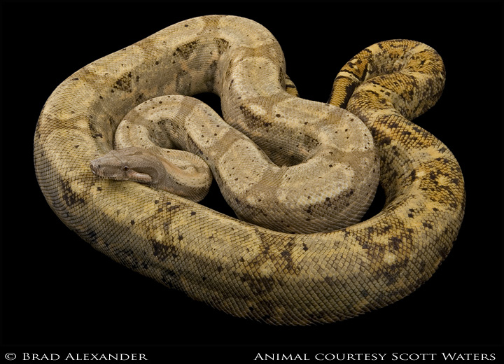
Shot on a black background, there was very little done to this image. My high end system at home shows proper color and a well lit snake. I'm at work now and from this PC it doesn't look as it was intended. It's a fairly dark image on this work PC with a lot more light fall off towards the black background at the base. The color is off - more yellow than actual.
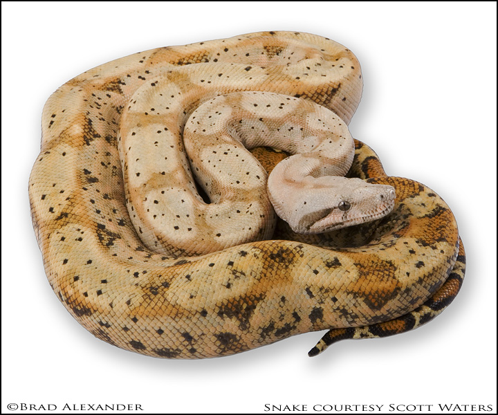
Same situation with this image in regards to my home PC verses my work PC. At home it has proper color and is not so contrasty. But on my work PC, it looses detail in the dark areas under the head/chin and the color is off.
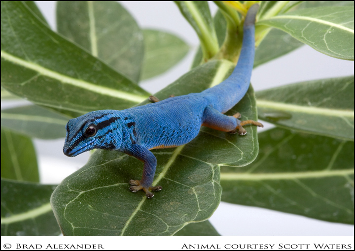
Not a boa, but an example anyway. Again, same problems - home PC verses work PC. Too contrasty, too punchy, loss of detail on face and in front of eye. At home it looks fine.
The same is true for the rest of these images...


-----
Brad Alexander

fullsp.com
[ Hide Replies ]
 Speaking of photoshop... again> - Brad Alexander, Tue Oct 21 14:04:09 2008 Speaking of photoshop... again> - Brad Alexander, Tue Oct 21 14:04:09 2008
|